Partner Brand Kit

Opal
Brand Kit

Everything you need to represent Opal. Assets, guidelines, and usage rules — all in one place.

01 — Colors

Color System

Built on pure black and white. Gradients are reserved for in-app milestone moments — never as backgrounds or dominant elements.

Core Palette
Background
#000000
Main Text
#FFFFFF
Secondary
#BCBBC0
Surfaces
#3A3A3A
Gradient Accents — App Only
Gradient 01
#E2C9FF → #8CFFDD
Gradient 02
#A9CBFF → #B39AFF
Gradient 03
#D4FF9C → #9EF9FF
02 — Typography

Type System

SF Pro Text across all touchpoints. Match these styles when setting text alongside Opal assets.

Bold — Headlines
Focus is hard.
We made it easier.
SF Pro Text Bold · 700 · −0.04em · #FFFFFF
Semibold — Subheadings
The #1 Screen Time App
SF Pro Text Semibold · 600 · −0.02em · #FFFFFF
Medium — Body
Opal helps you take control of your screen time and find your flow — without willpower, guilt, or tracking every tap.
SF Pro Text Medium · 400 · #BCBBC0
Bold OTF Semibold OTF Medium OTF
03 — Logos

Logo Usage

Always use as provided. Never recreate, recolor, stretch, or apply effects.

Wordmark
Opal White
Opal Black
Crest
Crest White
Crest Black
Co-branding: Both logos must be the same optical height. Separate with equal spacing or a thin divider.
04 — App Icon

App Icon

Use as provided. Do not crop, reshape, add borders, or modify.

Opal App Icon

Opal App Icon

Display at its original rounded-square shape. Do not place inside another container or add shadows.

↓ Download PNG
05 — Gems

Focus Gems

3D gems representing focus milestones. Always on pure black. Never crop, recolor, or overlay text.

Milestone 5
Milestone 5
Milestone 6
Milestone 6
Milestone 7
Milestone 7
Milestone 8
Milestone 8
Milestone 13
Milestone 13
Milestone 14
Milestone 14
06 — Screenshots

App Screenshots

Official screenshots. Scroll to browse, hover to download. Do not crop or annotate.

07 — Assets

Brand Imagery

Key visuals for partner materials. Use only provided files.

Hero Visuals
Opal Hero with Logo
Opal Hero — With Logo ↓ JPG
Opal Hero Background
Opal Hero — Background ↓ JPG
Badges
Ratings App Store Ratings · ↓ ADA Apple Design Award · ↓
08 — Rules

Do's & Don'ts

Non-negotiable. Reach out before publishing if unsure.

✓ Do

Use white logo on dark/black backgrounds
Use black logo on white/light backgrounds
Maintain clear space around the logo
Match optical height in co-branded placements
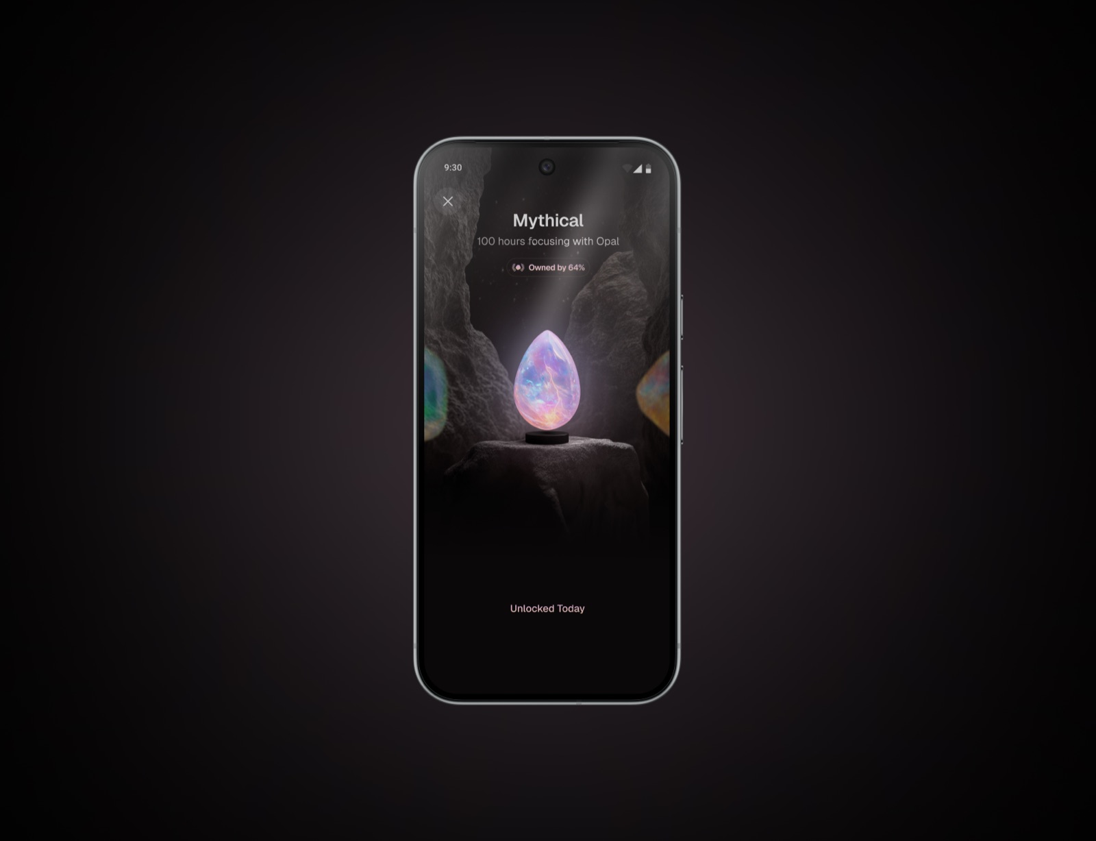
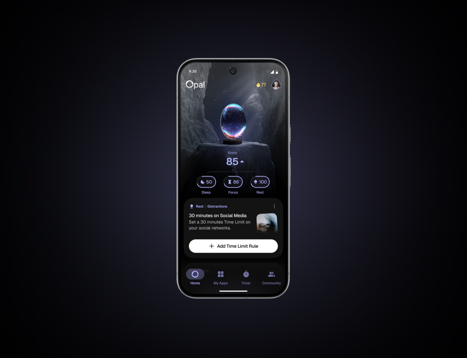
Display gems on black backgrounds only
Use provided files in original format
Refer to the app as "Opal" — capital O
Reach out if you need a variation

✗ Don't

Place white logo on light backgrounds
Place black logo on dark or busy photos
Stretch, rotate, skew, or distort
Apply shadows, glows, or effects
Recolor beyond pure white or black
Crop the logo or cut off elements
Recreate the logo from scratch
Use gradients as backgrounds
Apply filters to any asset
Overlay text on gem sculptures
Screenshot or re-export from the app
Imply endorsement beyond agreed scope
09 — Download

All Assets

Tap a category to expand, then download individual files.

Logos & Crests4 files
App Icon & Imagery3 files
Focus Gems6 files
Badges2 files
Screenshots12 files
Fonts3 files
10 — Contact

Questions?

Need a custom asset or have a use case not covered here? Reach out before publishing.

Contact: nour@opal.so
Website: opal.so
Reach out →